The Custom Design Process: Katie & Adam
This is the fourth installment in my series, The Custom Design Process, where I walk through the steps I've gone through with a particular client to come to their final custom designed invitation. I find it so fascinating, once a design is finished and the invitations have been printed and mailed, to go back in my files and look at the very first draft for my client. Because most of my proofing process is digital, I have files saved in my email and on my computer from every single step of the way. Some designs are very close at the first draft, and the final design isn't too far removed, but others start out SO far from how they finish. If you've ever wondered what the process can be like, here you go! Katie & Adam
1. Inquiry- The first step in the process is for the client to reach out and start the conversation about what s/he is looking for in an invitation. Sometimes this includes sharing Pinterest inspiration, color choices, and general feel. And sometimes, it's a big fat "I have NO idea."
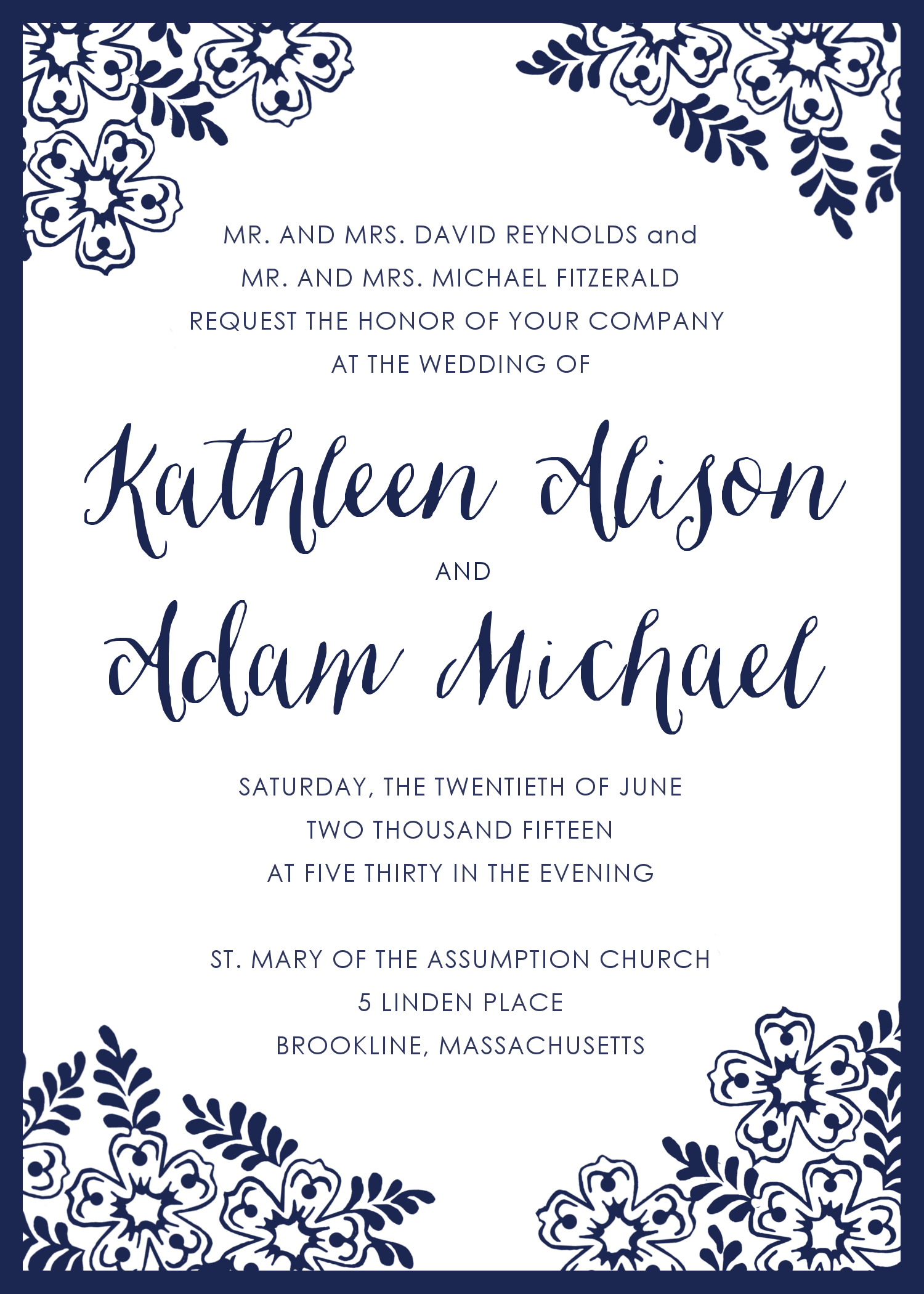
Katie had ideas. Lots of them! She was a bride on a mission, and provided me with lots of direction right from the get go. It was so easy to hone in on her style--she sent me links to invitations she was leaning towards, which made me see right away that she wanted something more traditional with a little creative flair. "Nothing boring" is what she said. Their colors would be navy, light green, light blue, and light pink, and their reception was at Alden Castle, a Longwood Events venue in Brookline, MA. She picked out a design from my own collection that was closest to what she wanted, and they had already done a Save the Date that she wanted to match, at least somewhat, in style:
![_MG_2632[1]](http://static1.squarespace.com/static/5612e4dde4b0b9b281e9597a/5612e574e4b0eb177eab2086/5612e586e4b0eb177eab2634/1444078982014/mg_26321-e1438182415503.jpg?format=original)
2. First Looks - The next step is for me to start drafting up some samples based on the ideas the couple provided. I generally provide three First Looks.
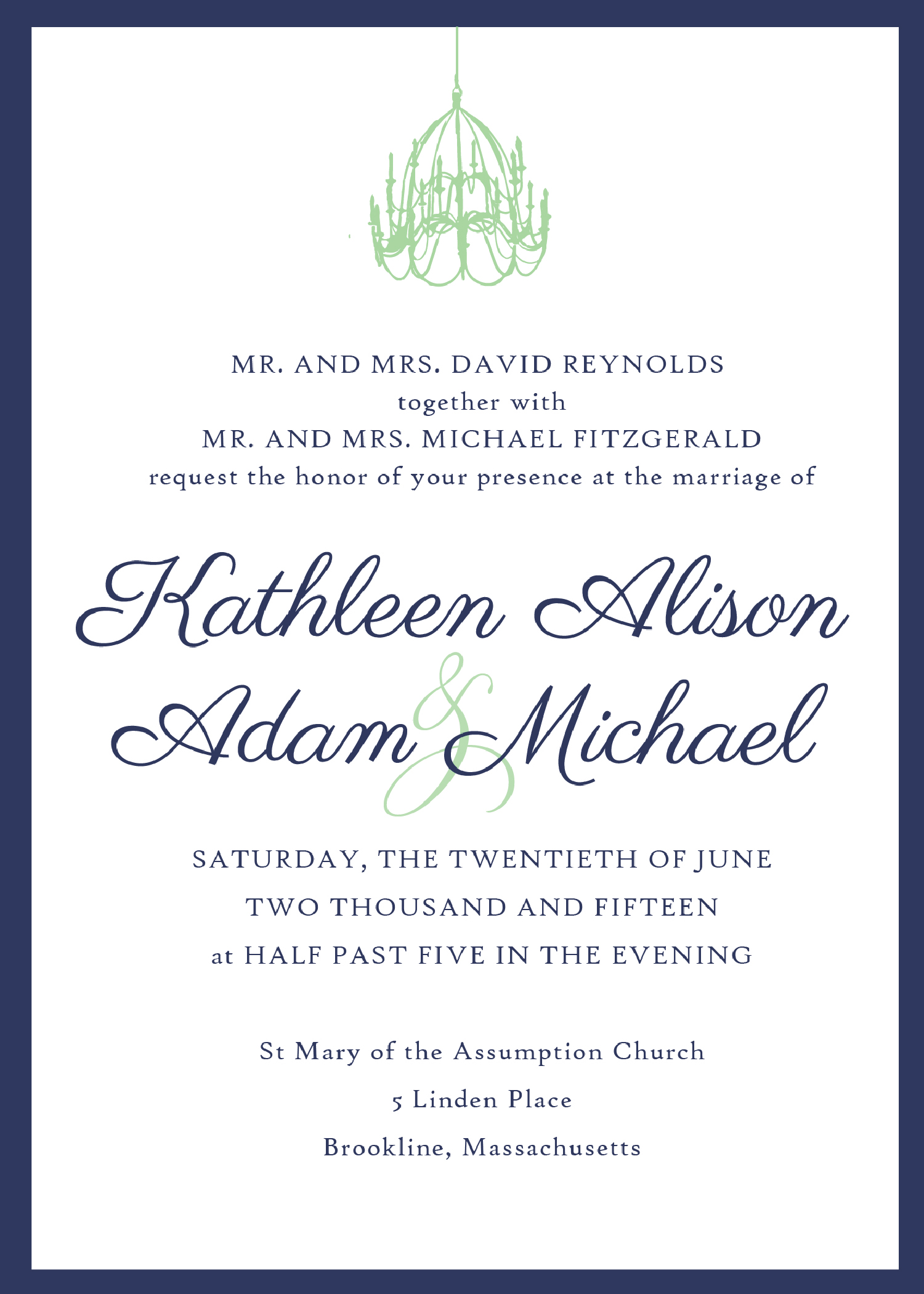
Katie wanted to play with the iconic chandeliers of Adlen Castle, since they had used an image of a chandelier on their Save the Date. But she also said they might like to use some kind of lace image. The examples she sent me all had a sort of lacy border around them, so I tried to incorporate that in one of the First Looks. The third option used a fine paper with gold and tiny glitter accents in a layered style:


3. Honing in - The next step is for me to create another set of proofs based on elements from the First Looks that the client wants to see more of -- which fonts they like, which layout is best, and which color combination they prefer.
Not surprisingly, they went with the Chandelier design. The image was actually pulled from a photograph from inside Alden Castle, so the chandelier was a perfect match to their venue. Next up was the 2015 Battle of the Fonts. If am slightly font-obsessed, Katie Reynolds was certifiably font-crazy. (I can say that because she knows it's true, and she knows I love her for it!). They didn't love the formal, swirly look of the fonts on the first draft, so I sent over some script options and then some new versions based on their choices. We also swapped out the border to a navy:
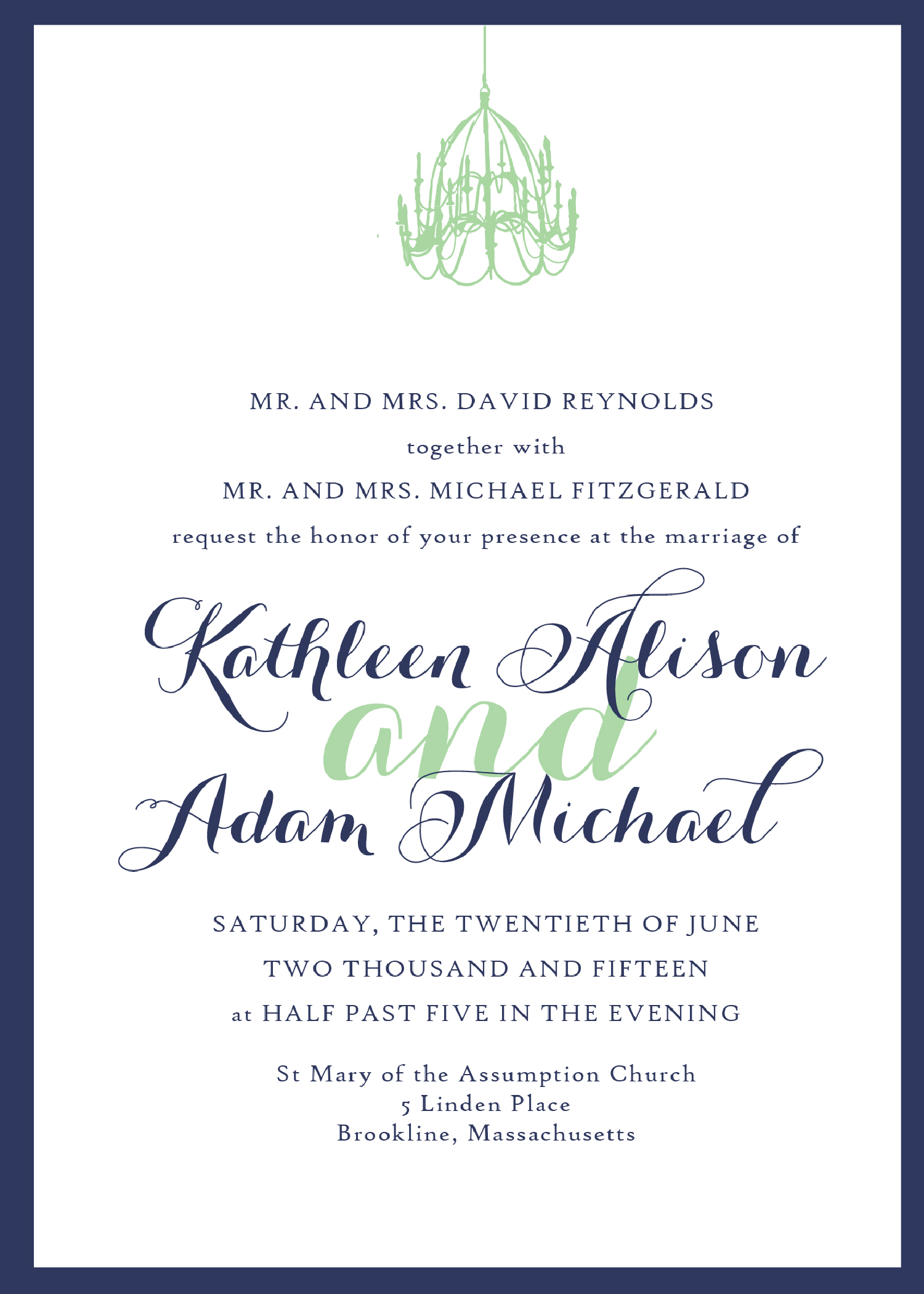

When I say Katie was font-crazy, I say it lovingly, but I also mean it. I think she had dreams nightmares about fonts. I won't let the public in on how many emails really went back and forth on the tiniest of font details, but the short story is that we settled on the font from Option Two, with the ampersand from Option Three, with lots of glyph alterations. We also added back in the green border in addition to the blue, and I lightened up the chandelier to make it feel a little more delicate:

3A. The Inserts:Once the design is in place for the main invitation, I move on to the insert cards.
In this case we needed a Reception/Details card and an RSVP, which I actually started before the invitation fonts were settled on. Katie had been very specific about wanting one of the cards to be light lettering on a dark background:


After seeing these first drafts, Katie asked if we could bring in the chandelier, and had the idea to maybe incorporate an image of Alden Castle. I switched up the page orientation, and did a rendering of the castle. Once we sorted out the fonts, those were swapped out as well:


4. The Details - Putting the finishing touches on a design is maybe my favorite part. This is where I hand my design over, so to speak, to the couple, and let them perfect all the details to their taste and their event.
Once the three main pieces were put together, we started playing with different ways to present the whole package. Katie wanted a sash with some kind of square seal with either their names or a monogram, and we added in a green RSVP envelope to add another layer of color. The whole piece was presented in a white envelope with navy liner, with printed addresses on everything. I LOVE how this all came together!


5. The Accessories - For many of my clients, the invitation is just the beginning. As the wedding nears, there are other items that get added to the list -- welcome cards, menus, programs, favor tags, you name it. All these printed items can (and should, if you ask me!) be coordinated with your invitations. And the good news is, once the invitations have been finished, all the hard work and decision making has been done. The other pieces come together much more quickly because the design theme is already in place!
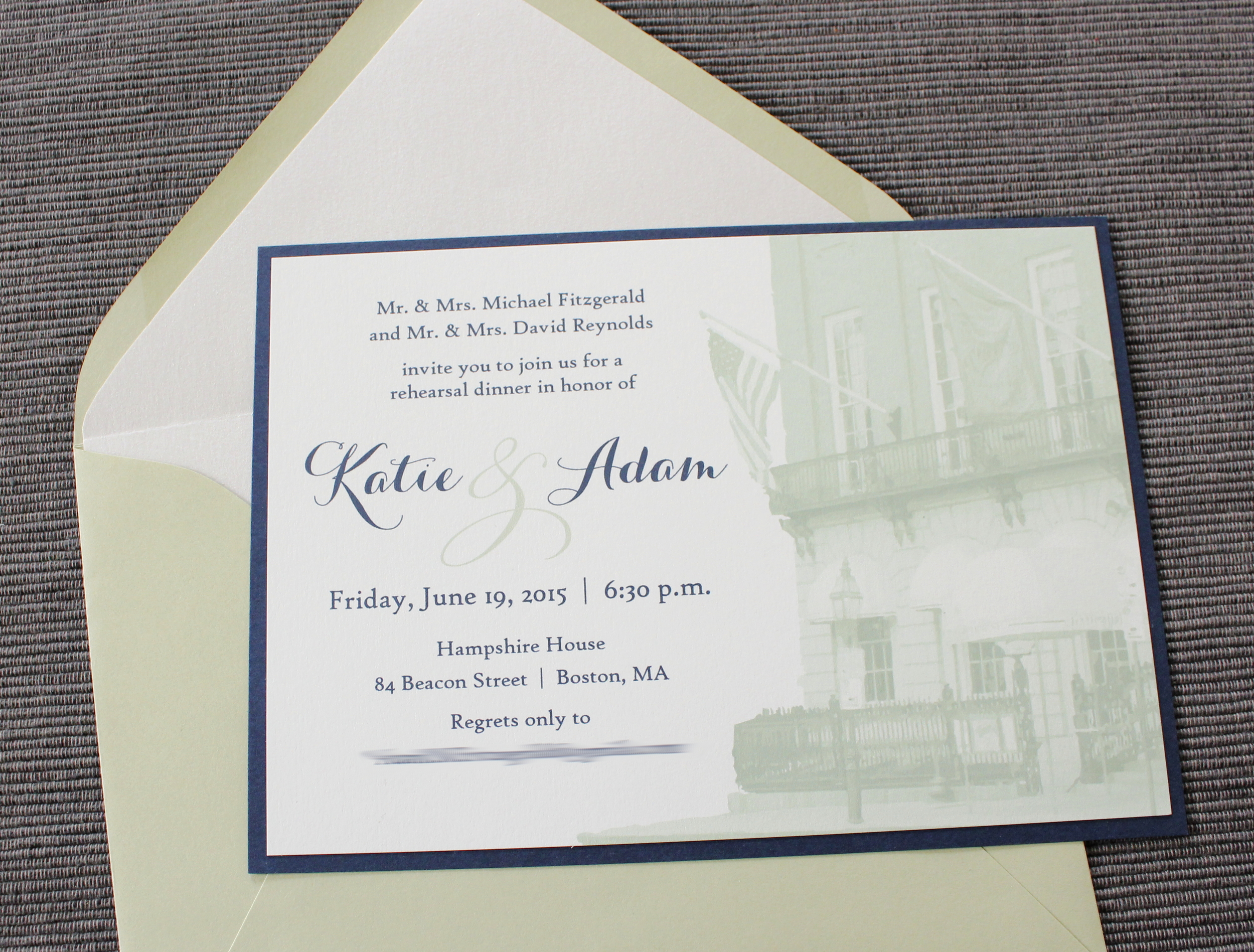
Katie and Adam decided to carry the design through their Rehearsal Dinner Invitation, which was to be held at the Hampshire House, also in Boston. I employed the same techniques I used to manipulate the image of Alden Castle, and switched up the colors to make it feel different but related:

They also added ceremony programs with coordinating fonts and colors:

And menus that poked out of the napkins and incorporated the chandeliers that hung over the tables:

This invitation, along with many others, is available on my Etsy shop!
Stay tuned for more Custom Design Process posts!