The Custom Design Process: Shayna & Kim
This is the third installment in my series, The Custom Design Process, where I walk through the steps I've gone through with a particular client to come to their final custom designed invitation. I find it so fascinating, once a design is finished and the invitations have been printed and mailed, to go back in my files and look at the very first draft for my client. Because most of my proofing process is digital, I have files saved in my email and on my computer from every single step of the way. Some designs are very close at the first draft, and the final design isn't too far removed, but others start out SO far from how they finish. If you've ever wondered what the process can be like, here you go! Shayna & Kim
1. Inquiry- The first step in the process is for the client to reach out and start the conversation about what s/he is looking for in an invitation. Sometimes this includes sharing Pinterest inspiration, color choices, and general feel. And sometimes, it's a big fat "I have NO idea."
Shayna was on the ball with invitations. She contacted me ten months before her wedding, and even before her engagement was officially announced. This girl was excited. She said she wanted her wedding to be "Romantic, Classic but Unique, Rustic, Fun, Energetic". It would be at Sakonnet Vineyard in Little Compton, Rhode Island in June 2015. She gave me a little guidance with colors: "Pastels. Pink, yellow, gray with some bold accents in the pink family." I visited the venue's website, and found gorgeous photos of waterfront countryside and rolling hills.

2. First Looks - The next step is for me to start drafting up some samples based on the ideas the couple provided. I generally provide three First Looks.
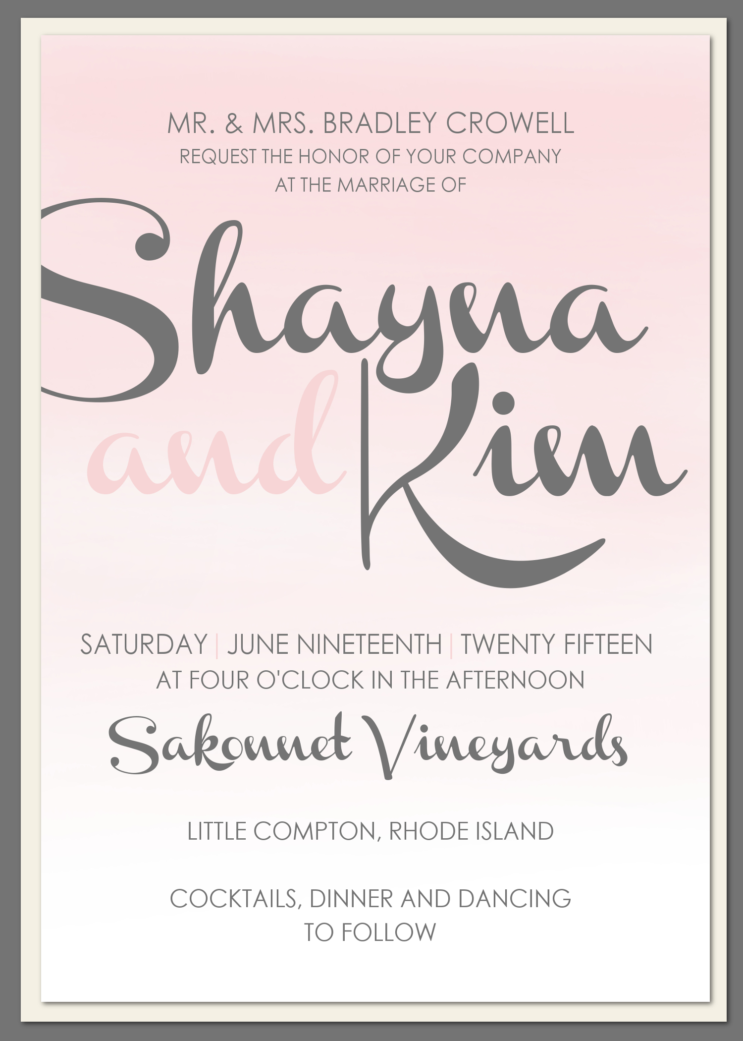
I tried to capture the seaside vineyard vibe, bringing in some softness and romance with pastels and pinks. Honestly, I wasn't loving any of them, and had a hard time grasping what Shayna was going for. How do I capture seaside winery (which makes me think of navy and white and burgundy) with her color scheme? I came up with some very rough drafts, mostly with the intention of feeling out her style a little more:


3. Honing in - The next step is for me to create another set of proofs based on elements from the First Looks that the client wants to see more of -- which fonts they like, which layout is best, and which color combination they prefer.
Of the three, Shayna liked the peony design the best, but as expected, none of them were very close. She liked the fonts from the peony design, but was looking for more of a watercolor look--she didn't like the crisp edges against the grey, and wanted the whole thing to look softer. So I stayed with a floral theme, and came up with some other options. To take care of the watercolor, I asked my aunt, Susan Farnsworth, if she would take a crack at painting some peonies for the design. I tried one with a white background to brighten it up, and one with a textured grey:


We were getting closer in style, but it turned out Shayna jumped the gun on invitations a little too early in her planning (yes, there is a limit to how early you should start!) We let the design sit for almost 4 months, and as Shayna's wedding was drawing near and her wedding details were falling into place, she realized it didn't quite work anymore. In her planning, she had found that her style was actually a little more traditional and preppy, and she asked if we could scratch the original designs, and start over. So, back to step 2 it was!
2. First Looks - The next step is for me to start drafting up some samples based on the ideas the couple provided. I generally provide three First Looks.
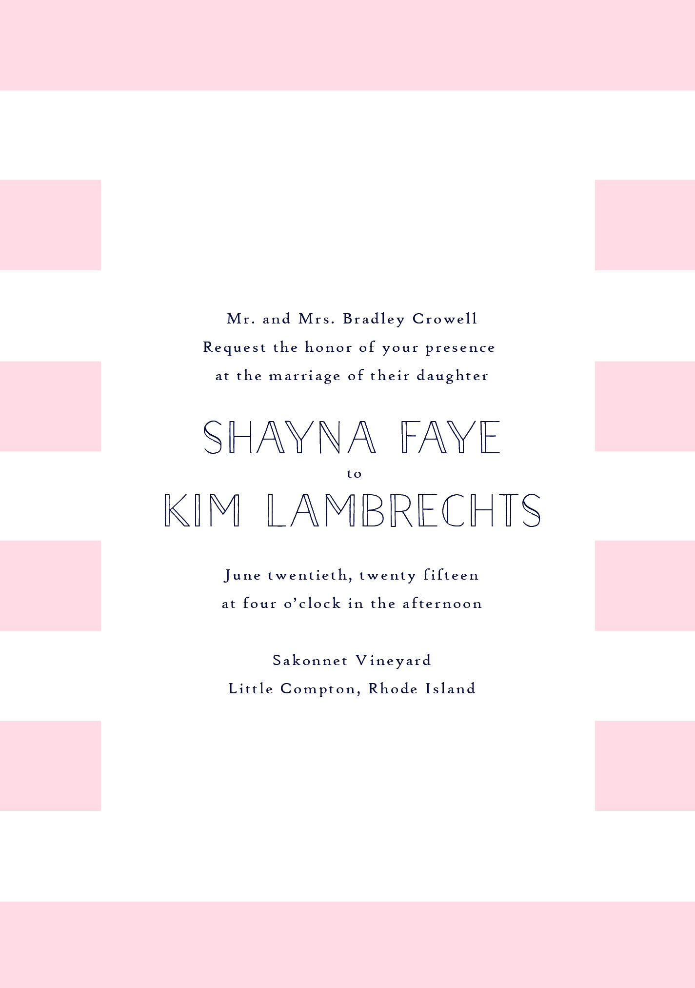
She had developed what she called an "obsession" (her words, not mine) with pink and white stripes, so that was a specific request. In general, she wanted the invitations to be more traditional and formal feeling, so I took another shot. I couldn't quite give up on the peonies, so they made a reinvented appearance:


3. Honing in - The next step is for me to create another set of proofs based on elements from the First Looks that the client wants to see more of -- which fonts they like, which layout is best, and which color combination they prefer.
Turns out, Shayna's original instincts were closer that she thought! The peonies were actually still her favorite, but the design was a little too bright and modern, and she wanted to adjust the wording. So, I lightened up the peonies, made it more symmetrical and swapped out the wording:
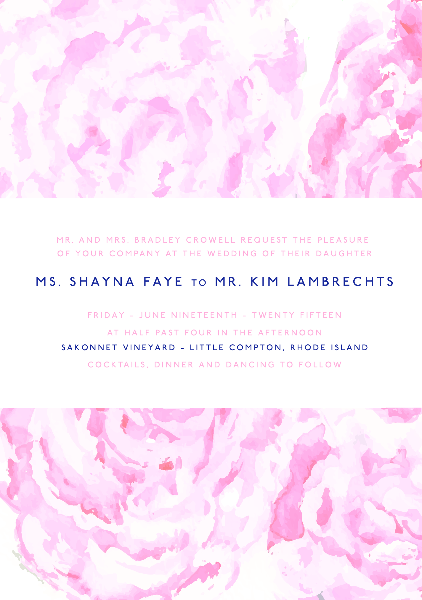
We were getting closer, but Shayna still felt like the font was too modern, and she didn't love that we had lost the green leaves. So, I added in some formal script, got rid of the all-caps, and brought the leaves back in. I also added the option of removing the rectangle in the center, softening it up even more:


4. The Details - Putting the finishing touches on a design is maybe my favorite part. This is where I hand my design over, so to speak, to the couple, and let them perfect all the details to their taste and their event.
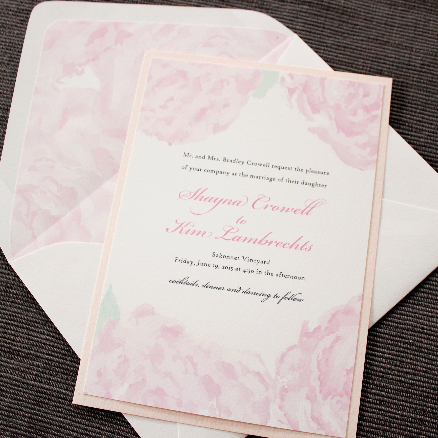
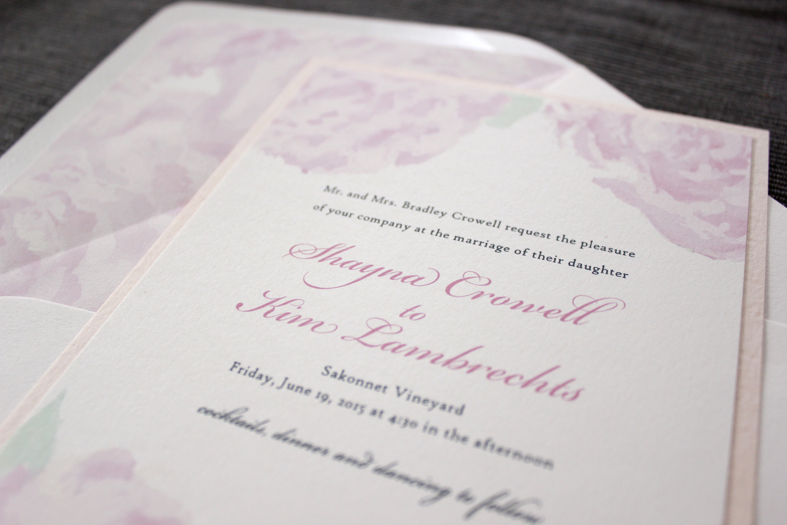
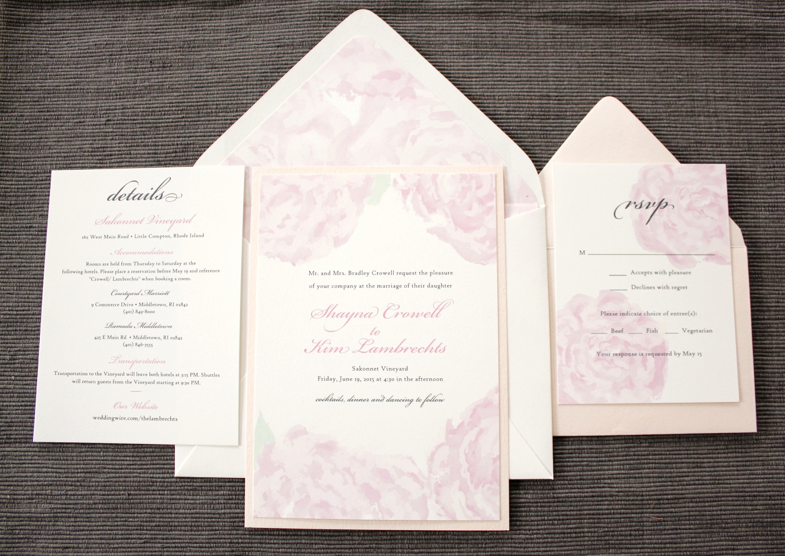
Shayna was ready to lock it in! She loved the version with no rectangle, and after a few drafts of the RSVP and Details card (we tried out those stripes again for a minute) we settled on the final design. The text was printed in dark grey and light pink, and we carried the peonies over into a vertical RSVP card with blush envelope. The invitation was mounted on a blush backing, and a peony-lined envelope brought the whole suite together.

It was a lot of work to get to the finished product, but I love how it came out! I love a challenge, and honing in on the perfect design for a client who doesn't exactly know what she wants is all part of the fun. It's so rewarding to finally get there and see it all come together!
5. The Accessories - For many of my clients, the invitation is just the beginning. As the wedding nears, there are other items that get added to the list -- welcome cards, menus, programs, favor tags, you name it. All these printed items can (and should, if you ask me!) be coordinated with your invitations. And the good news is, once the invitations have been finished, all the hard work and decision making has been done. The other pieces come together much more quickly because the design theme is already in place!
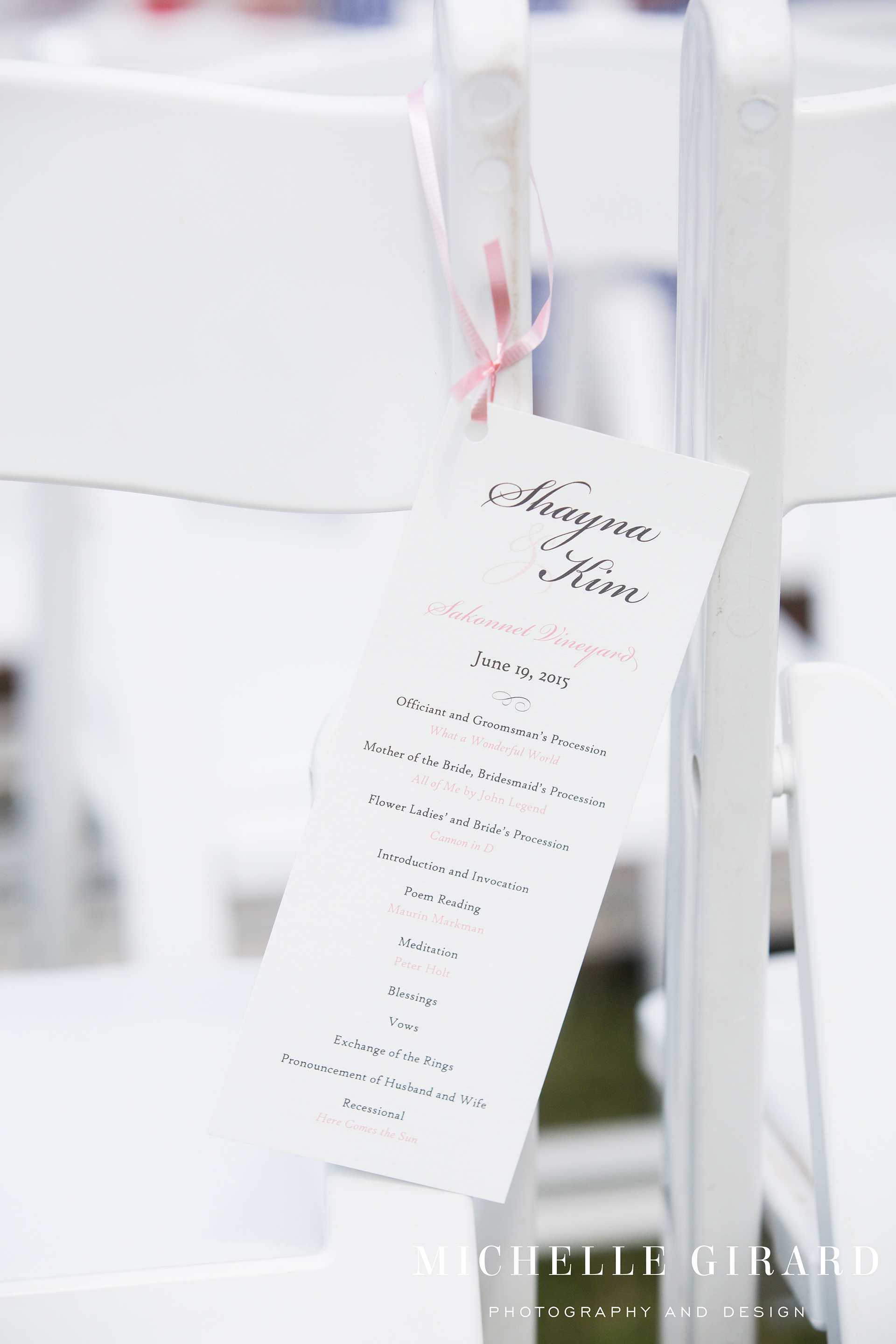
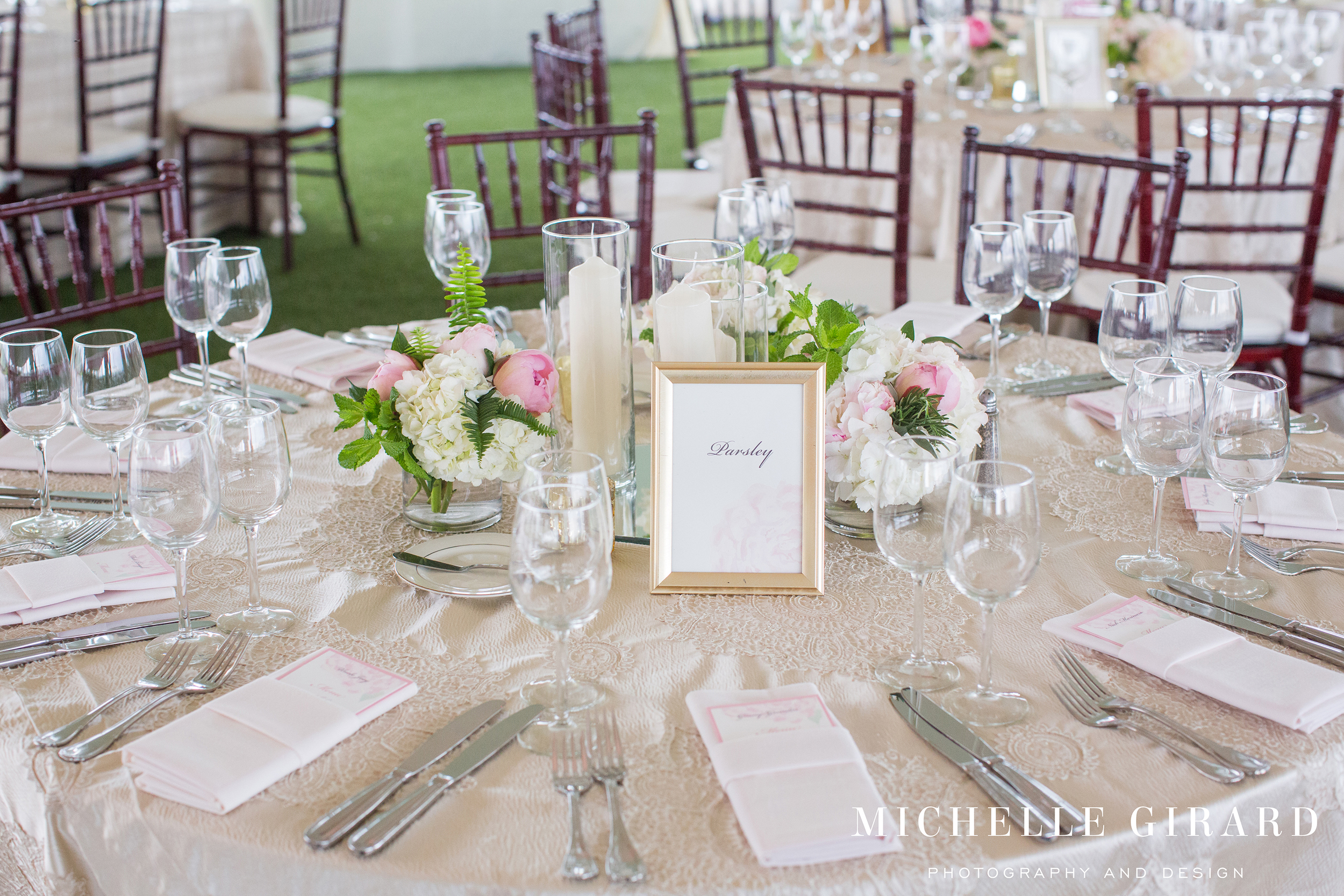
We designed ceremony programs, a seating chart, and menus with printed names that served as place cards (love that idea!)

We did custom stickers for her welcome boxes at the hotel, and we finally brought in those pink stripes on the stickers for their spice jar favors:

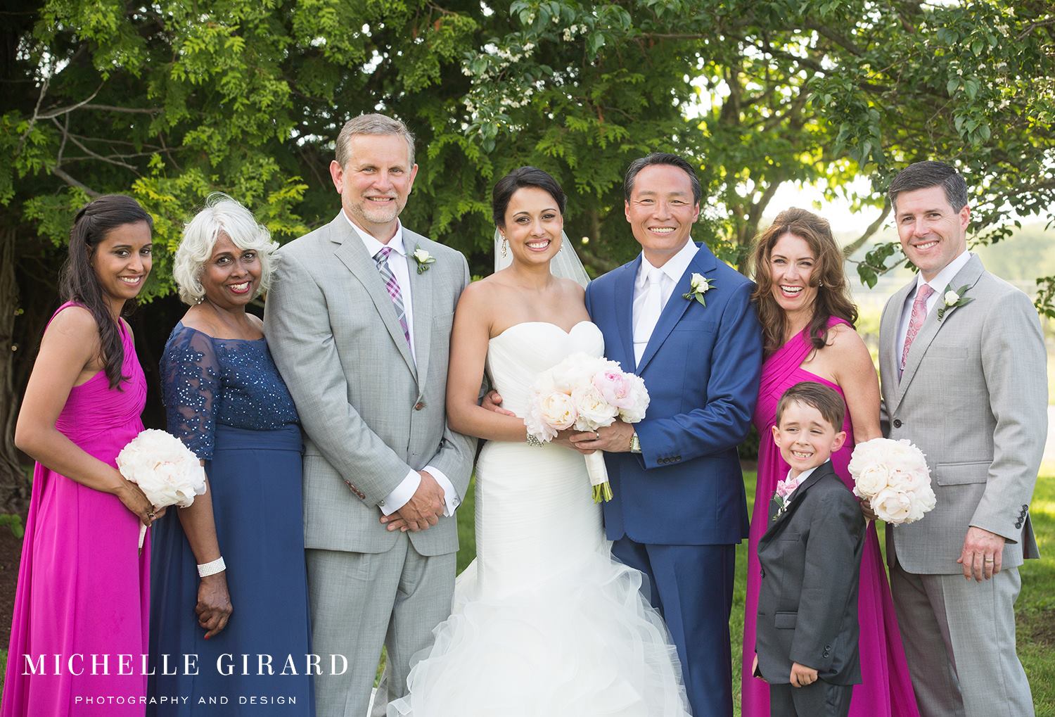

What a gorgeous wedding! The bridesmaids wore bright magenta dresses, there were just-popped peonies everywhere, and Shayna and Kim were glowing. Congratulations to the happy couple, and thank you so, so much for your business! It was a pleasure helping with your big day!
This invitation, along with many others, is available on my Etsy shop!
Stay tuned for more Custom Design Process posts!
Gorgeous Wedding Photography by Michelle Girard